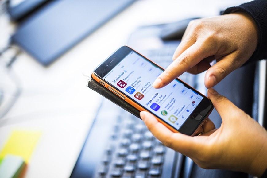
Mobile apps are worth billions and icons are key to their success

Several icons are displayed on each smartphone or tablet screen. Behind these little images are various software, apps and games. Naturally, each developer hopes that users enjoy spending time on their application. An extensive study has now been conducted on what makes an icon popular.
Researcher and doctoral candidate Henrietta Jylhä works in the Gamification Group at Tampere University. Jylhä’s recently published study examined what kind of perceptions are induced by various icons, and which of these perceptions betoken the user’s intention to click and download the app.
”Generally speaking, the results indicate that appealing aesthetic and high quality make an icon popular,” Jylhä summarises.
Another aspect that clearly stands out in the study predicting icon success is uniqueness – in other words how well the icon sticks out from the mass.
”The findings revealed that abstract shapes along with unexpected colour schemes and elements add a sense of uniqueness in an icon and therefore also popularity,” Jylhä says.

Quality is evident even in small visuals
A high-quality impression requires high resolution. Even though icons are small in size, the most popular ones contain a large number of pixels. Details are important, such as framing. In the most popular icons, the edges were rounded.
The researcher also takes notice of harmonious use of colours.
”The colour palette must be stimulative, but not chaotic. Therefore, complementary colours, such as red and green as well as adjacent colour themes attract users. This observation supports the choices that seem to be popular in icon design,” Jylhä says.
Perhaps the most surprising result concerns icons that portray sadness.
”Icons that were rated as sad were more likely to lead into a purchase decision. The effect was subtle in the study and as such, it is difficult to deduce a reliable cause for it. Based on consumer studies, however, we can conclude that the product should create an emotional bond with the buyer. Perhaps a sad-looking icon evokes our empathy,” Jylhä describes.
Fish, dragons and voodoo dolls
In the study, a total of 68 icons were examined. They were chosen among various game application genres, such as adventure, card, action, pedagogic and music games. Each of the 569 respondents assessed four icons. Of the respondents, 52.2 per cent were male and their average age was approximately 27 years. The survey responses were collected online.
The respondents were asked to evaluate the icons from four perspectives: What overall grade would you give the icon? Would you click the icon? Would you download the imagined app? Would you buy the imagined app? In addition, the respondents’ views of the icons were measured using a battery of 22 adjective pairs (such as beautiful–ugly).
The most popular icons included imagery of a fish, a fire-spitting dragon and a voodoo doll. Some of the abstract icons also appealed to the respondents.
”In a nutshell, we could say that harmony seems to engage users. Soft, active and masculine features in icons predict their desirability in addition to high quality and uniqueness,” Jylhä summarises.
Game icons are designed with great care
App markets are a billion dollar business globally, but there has been little scientific research on app icons.
Jylhä herself has pursued digital drawing for a long time and she also has a history in working for a game startup. In the industry, the importance of icons has already been realised.
”In the apps business, major investments are made in icons. To my surprise, there has been very little research on the topic in the academic world,” Jylhä says.
The largest companies involved in mobile application development perform routinely so-called A/B tests. The idea is simple: two slightly different versions are designed of an application, icon or website, and a test is completed on which version the users prefer. Next, a new A/B test is carried out. This way, the product is continuously improved based on customer feedback.
“The larger the company, the more resources they have for conducting A/B tests. Investments in icon appearance really are worth the effort, as according to our study, the quality of an icon has a direct correlation with how clickable, downloadable and buyable the product is,” Jylhä notes.
Text: Jaakko Kinnunen
Photos: Jonne Renvall


